CSS의 레이아웃 관련 스타일에 대해 알아보자
레이아웃
✔️ 블럭 요소: 한 줄 단위로 영역이 잡힘 / 자동으로 줄 바꿈 발생 (div, p, pre, h, ...)
인라인 요소: content 부분만 영역이 잡힘 / 옆으로 배치됨 (span, label, input, img, ...)
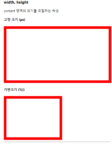
width, height
👉🏻 content 영역의 크기를 조절하는 속성
    <style>

        .size-test {
            border : 10px solid red;
        }

        #test1 {
            width : 400px;
            height : 200px;
        }


        #test2 {
            width : 50%;
            height : 150px;
        }
    </style>


<body>

    <h4>고정 크기 (px)</h4>
    <div id="test1" class="size-test"></div>

    <h4>가변크기 (%))</h4>
    <div id="test2" class="size-test"></div>

</body>
display
👉🏻 블럭 요소와 인라인 요소의 속성을 변경해서 배치 방식을 변경
[ 표현법 ]
선택자 {
display : inline/inline-block/block;
}
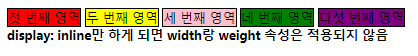
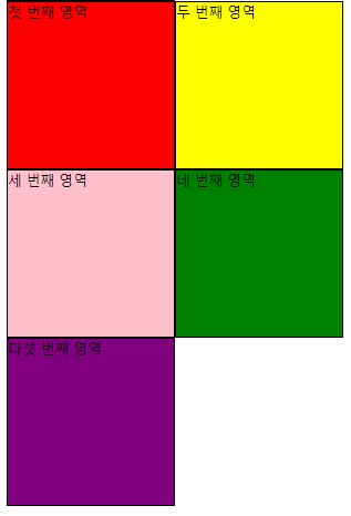
1) 기존에 블럭 요소인 div를 인라인 요소로 바꿔 보기
👉🏻 display: inline
👉🏻 before: 인라인 요소로 바꾸기 전

<style>
.size-test {
border : 10px solid red;
}
#test1 {
width : 400px;
height : 200px;
}
#test2 {
width : 50%;
height : 150px;
}
.display-test {
border : 1px solid black;
width : 150px;
height : 150px;
}
.red {
background-color: red;
}
.yellow {
background-color: yellow;
}
.pink {
background-color: pink;
}
.green {
background-color: green;
}
.purple {
background-color: purple;
}
</style>
<body>
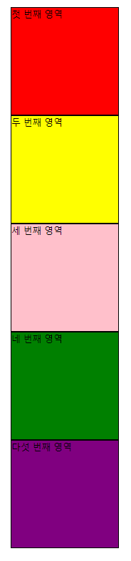
<!-- div.display-test*5 + Enter -->
<div class="display-test red">첫 번째 영역</div>
<div class="display-test yellow">두 번째 영역</div>
<div class="display-test pink">세 번째 영역</div>
<div class="display-test green">네 번째 영역</div>
<div class="display-test purple">다섯 번째 영역</div>
</body>
👉🏻 after: 인라인 요소로 바꾼 후
    <style>

        .size-test {
            border : 10px solid red;
        }

        #test1 {
            width : 400px;
            height : 200px;
        }


        #test2 {
            width : 50%;
            height : 150px;
        }

        .display-test {
            border : 1px solid black;
            width : 150px;
            height : 150px;
        }

                .red {
            background-color: red;
        }

        .yellow {
            background-color: yellow;
        }

        .pink {
            background-color: pink;
        }

        .green {
            background-color: green;
        }

        .purple {
            background-color: purple;
        }

        .inline {
            display : inline;
        }


    </style>


<body>

    <!-- div.display-test*5 + Enter -->
    <div class="display-test inline red">첫 번째 영역</div>
    <div class="display-test inline yellow">두 번째 영역</div>
    <div class="display-test inline pink">세 번째 영역</div>
    <div class="display-test inline green">네 번째 영역</div>
    <div class="display-test inline purple">다섯 번째 영역</div>

</body>
👉🏻 인라인 요소처럼 옆으로 배치는 하나, width와 height의 크기도 그대로 유지하고 싶을 경우

    <style>

        .size-test {
            border : 10px solid red;
        }

        #test1 {
            width : 400px;
            height : 200px;
        }


        #test2 {
            width : 50%;
            height : 150px;
        }

        .display-test {
            border : 1px solid black;
            width : 150px;
            height : 150px;
        }

                        .red {
            background-color: red;
        }

        .yellow {
            background-color: yellow;
        }

        .pink {
            background-color: pink;
        }

        .green {
            background-color: green;
        }

        .purple {
            background-color: purple;
        }

        .inline-block {
            display : inline-block;
        }

    </style>


<body>

    <h4>display : inline-block</h4>

    <div class="display-test inline-block red">첫 번째 영역</div>
    <div class="display-test inline-block yellow">두 번째 영역</div>
    <div class="display-test inline-block pink">세 번째 영역</div>
    <div class="display-test inline-block green">네 번째 영역</div>
    <div class="display-test inline-block purple">다섯 번째 영역</div>

</body>
* 참고: 인라인 요소의 경우 공백이나 줄바꿈으로 다음 요소를 작성할 시 약간의 틈이 생김
공백이나 틈 없이 다음 요소가 보여지게끔 하고 싶다면 한 줄로 연이어 쓰면 됨!
아래와 같은 꼼수를 이용할 수 있음
<!-- 코드 사이 띄어쓰기를 없애 주면 되는데 가독성 좋게 종료태그 닫기 전 엔터! -->
<div class="display-test inline-block red">첫 번째 영역</div
><div class="display-test inline-block yellow">두 번째 영역</div
><div class="display-test inline-block pink">세 번째 영역</div
><div class="display-test inline-block green">네 번째 영역</div
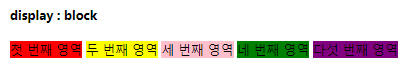
><div class="display-test inline-block purple">다섯 번째 영역</div>2) 기존에 인라인 요소인 span을 블럭 요소로 바꿔 보기
👉🏻 display : block
👉🏻 before: 블럭 요소로 바꾸기 전
    <style>

        .display-test {
            border : 1px solid black;
            width : 150px;
            height : 150px;
        }

        .red {
            background-color: red;
        }

        .yellow {
            background-color: yellow;
        }

        .pink {
            background-color: pink;
        }

        .green {
            background-color: green;
        }

        .purple {
            background-color: purple;
        }

    </style>


<body>

    <span class="disply-test red"> 첫 번째 영역</span>
    <span class="disply-test yellow">두 번째 영역</span>
    <span class="disply-test pink">세 번째 영역</span>
    <span class="disply-test green">네 번째 영역</span>
    <span class="disply-test purple">다섯 번째 영역</span>

</body>
👉🏻 after: 블럭 요소로 바꾼 후
(span 태그들이 블럭 요소화 되면서 width, height 속성까지 적용됨)
    <style>

        .display-test {
            border : 1px solid black;
            width : 150px;
            height : 150px;
        }

        .red {
            background-color: red;
        }

        .yellow {
            background-color: yellow;
        }

        .pink {
            background-color: pink;
        }

        .green {
            background-color: green;
        }

        .purple {
            background-color: purple;
        }

        .block {
            display : block;
        }

    </style>


<body>

        <span class="display-test block red"> 첫 번째 영역</span>
        <span class="display-test block yellow">두 번째 영역</span>
        <span class="display-test block pink">세 번째 영역</span>
        <span class="display-test block green">네 번째 영역</span>
        <span class="display-test block purple">다섯 번째 영역</span>

</body>